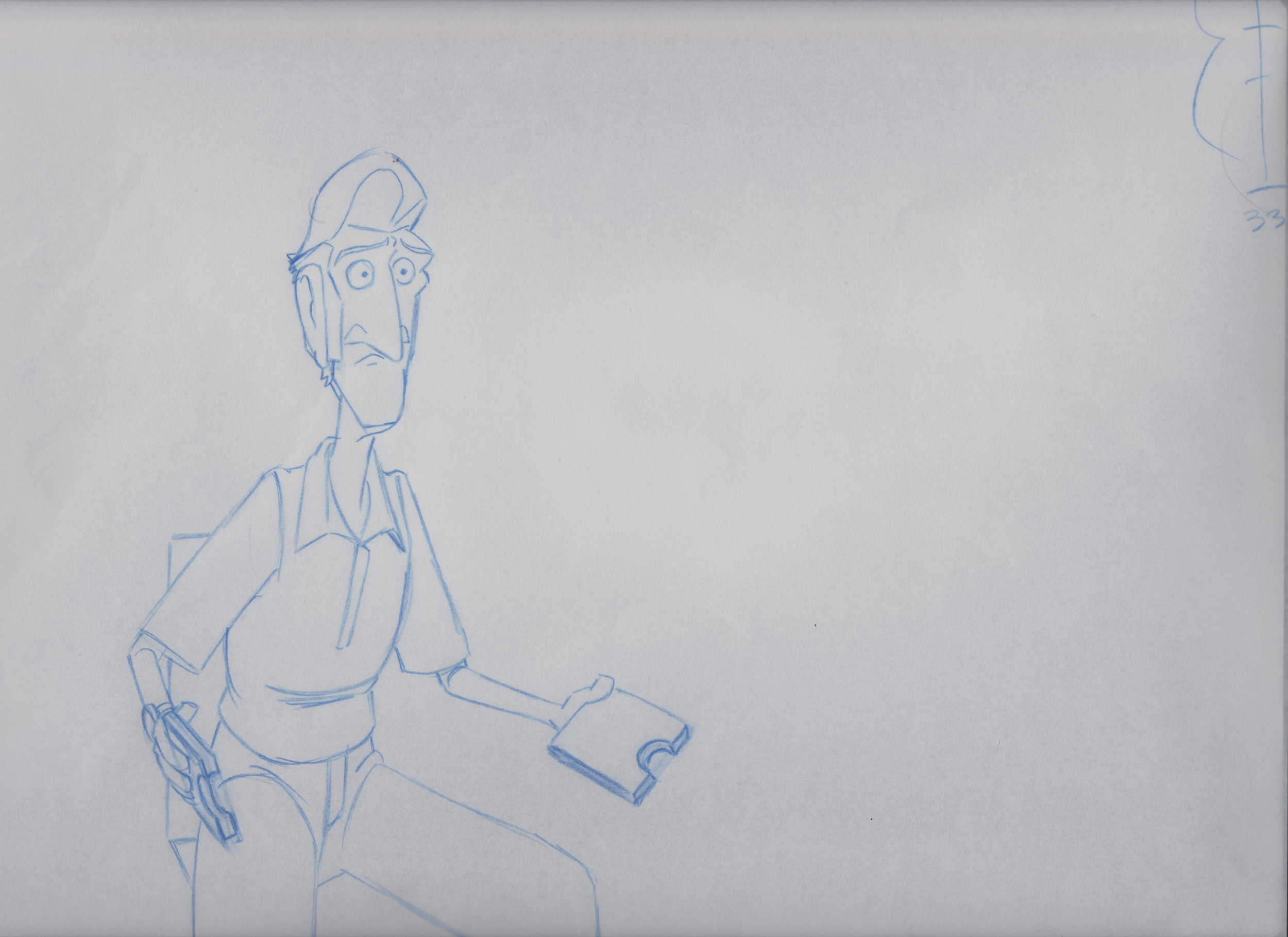
'Entrée' - a traditionally animated short film started back in 2011. The project started of as an animation test which grew into a short film based on a single shot gag inspired by Charlie Chaplin.
Below: The initial visualization in thumbnail form.
Thumbnail - Storyboards
Conceptual Design
Below: Aside from loosely being based on a Charlie Chaplin gag.....another contributing factor to the creation on the project was a character design turnaround I did back in 2010. This design was the starting point for the look of the film and its human character.
Designs
Character Designs
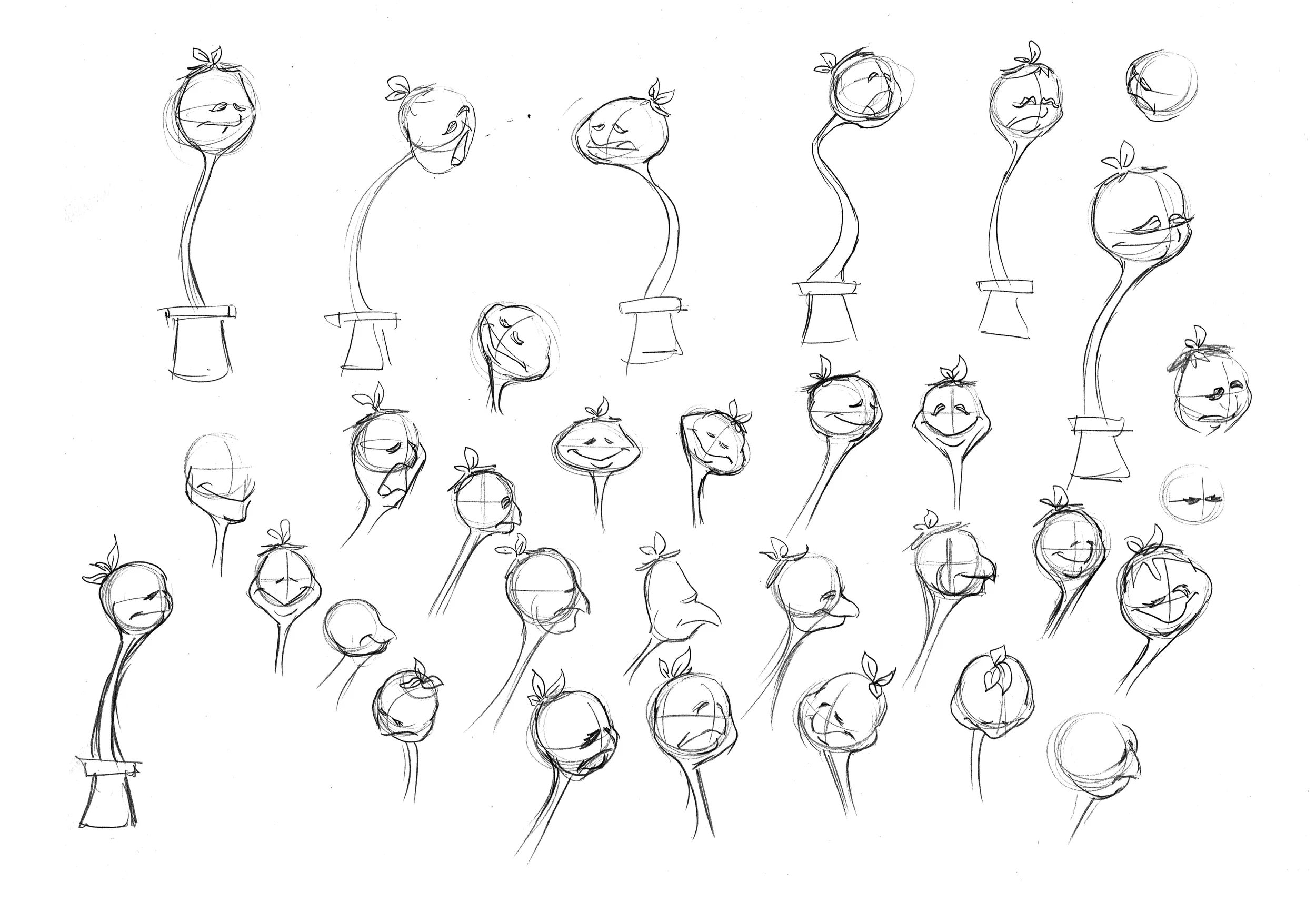
Below - Plant - Development: Since the human character had already been developed....I started work on the films main character 'The Plant.' I started off exploring the various shape designs and choosing 4 that I thought best fit the character. Then I ran each design through development....focusing on how the plant would transition from seeming to be a plant into an emoting character.
Above - Man - Development: Closing in on a final design for the plant I took the human character and ran it through a short development process. The focus was to make the design animation friendly whilst still maintaining its graphic nature. An earlier decision to have a full animation style in the traditional medium required the design to be flexible and easy to assist and clean. The designs above still were in development right up to animation.
Background Designs
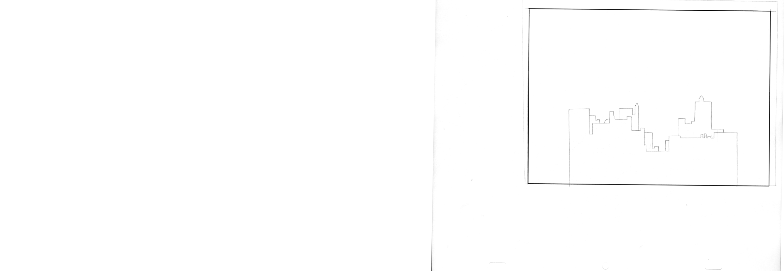
Below - Background development: The whole project is one shot cut into several scenes. The range of design for the BG was set to a profile view of the kitchen wall. When approaching the design I wanted to push the idea of isolating this plant. Using the idea of shapes - making the characters the only rounded smooth shapes in frame and everything else straights, squares and rectangles. Setting it in a city away from other plant/tree life....a concrete jungle. Using elements of the BG like the window to box the character in the frame.
Above - Background Design: Heavily influenced by Disney's '101 Dalmatians' BG style - I wanted to mirror the style of the characters and keep the block colour graphic sense to the world, with line work on top. The colour scheme for the film was chosen to once again push the idea of separating the plant from his surroundings. Keeping the man character and the kitchen cool neutral tones whilst the plant and the area around him in a more warmer/earthier range.
Layout
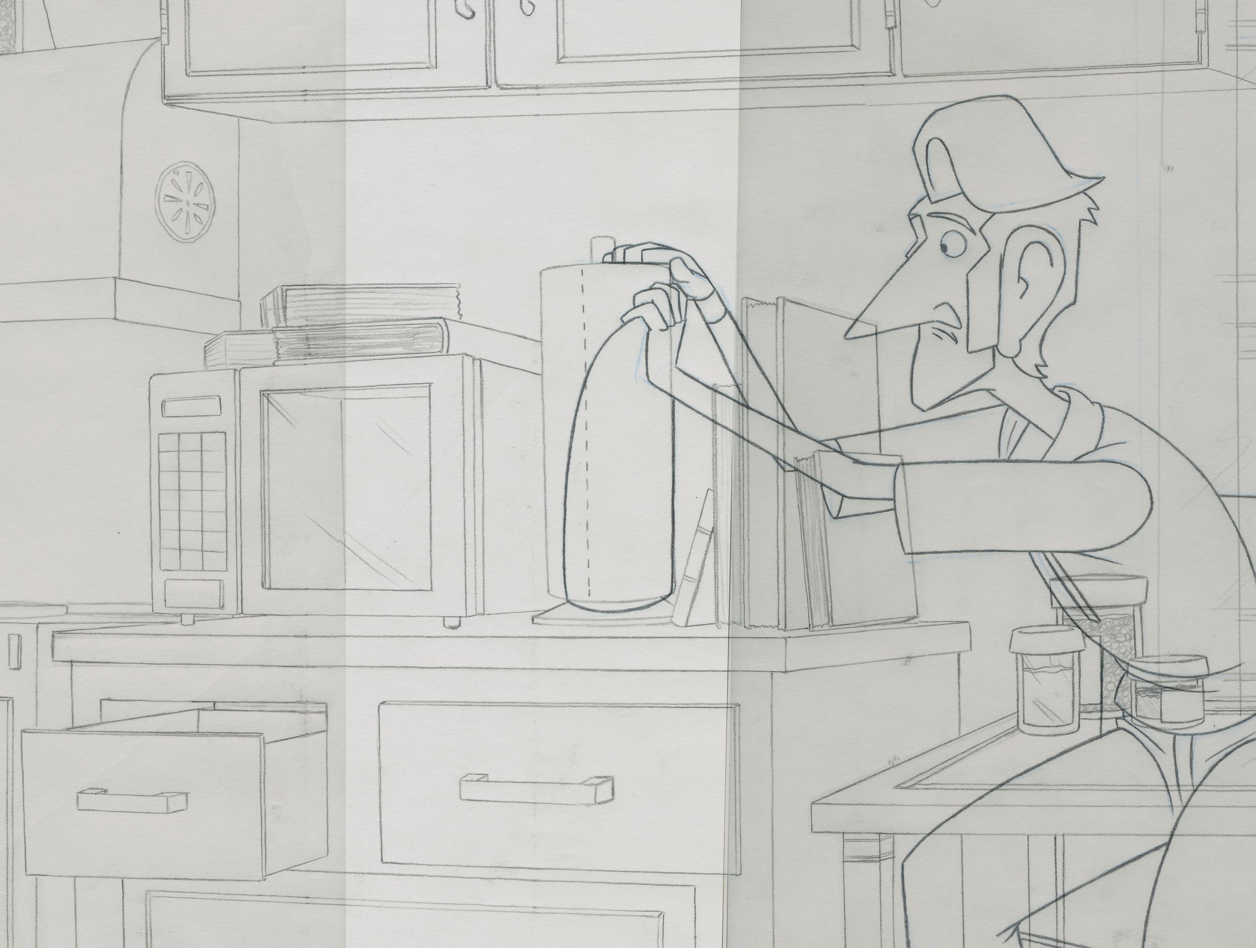
Below - Final Layout poses: As you can see from the clip below these first few pics show the final design of the man which became a simplified version easier to handle in animation. Before moving into compositing these images were used to hone in on the camera's staging and timing of camera moves.
Above - Rough Layout: Earlier design of man drawn very loosely. The timing and staging of the characters stayed relatively the same with a few minor changes here and there.
Animation & Assisting
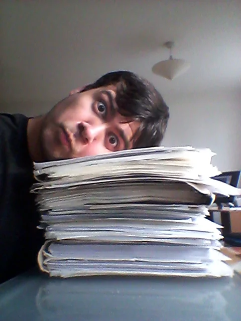
Below - Rough Animation: A picture of myself and the size of the project. When I started the project I had no money, no equipment, had just moved into an unfurnished apartment.....all I had was a light box and a few sheets of 12 field animation paper. When I started animating I had no line tests or computer to be able to time out the animation. So like the old great masters using nothing but a dope sheet and the ancient art of flipping....I would take my 30-40 second scenes and flip them in front of my eyes to see if the actions were working. I would have to wait every few weeks then take a night bus to my parents house and use their scanner to finish approving the timing on the shots.
Prior to animating each shot I would sit and plain using thumbnails to work out the actions and performances of the characters.
Above - Working Edit: Before moving forward into post production I cut a working edit of all the scenes with rough animation and backgrounds.....cutting a temp sound mix to go with the animatic.
Clean Up & Compositing
Below - Stages of Composite: Taking one pose from assisting....you can see its development from the hand drawn stage into finish render. Clean Up on this project was 60% hand drawn 40% digital hand drawn in TVPaint. Whilst making this project I have had to build the beginnings of my career in the animation industry.....this had not always afforded me the opportunity to working on it consistently. Over the last few years I have had to pick the project up then shelve it again. When coming to middle of Clean Up I was fortunately able to bring someone else on to help me finish up Production whilst I moved forward with Post Production. This lead to the hiring of Setareh Seto, a friend and fellow animation artist like myself. The last months of production were spent finishing off Clean Up and Colouring in TVPaint.....finalizing composting and applying all artwork to finished render scenes.
Above - Composites & Sound: After the final artwork was scanned....Colouring and Compositing was done in TVPaint 10.5. Due to the length of the scene.....the beginning and last shots were broken down into smaller scenes then composited into finial renders. Once happy with that the stresses then became about how to stitch them back together. Final image was the beginning of the sound mixing process which was done in adobe premiere. Foley was recorded by myself using a SM58 Microphone with a tascam recorder dr100 under a giant blanket sitting on the floor for 2 hours.
Below - Setareh Seto: Mid way through Clean Up and Colouring of the last scene. Many thanks goes to her for helping me cross the finish line.


